Underground Crypt
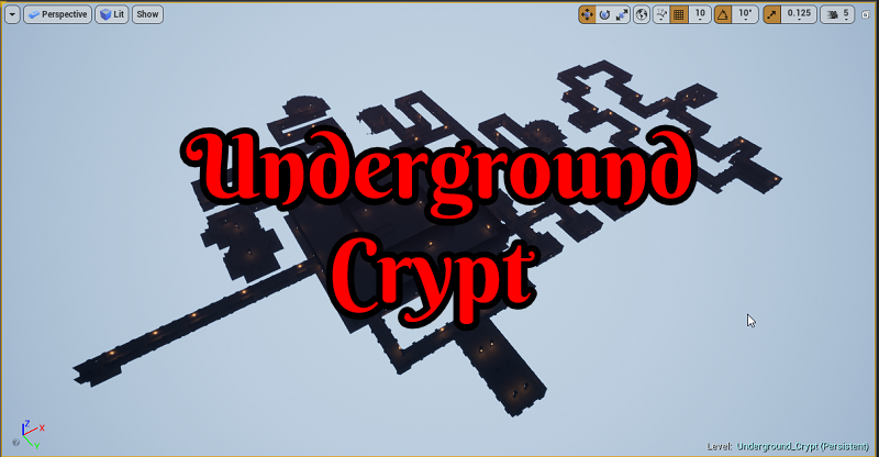
While I’m barely keeping up with my roadmap goals to get a bunch of zones out over the next month. As I push myself to do more while the world itself has slow down. I’ve managed to now create my second biggest indoor zone that is composed of over 8k+ objects. It also took about nine minutes to run through everything including all the rooms without any monsters.
My inspiration for this one was to create a center area everything else branches off of. This changes how my natural flow for a player tends to be in most of my dungeons as they move through one of them. While the massive room center is a bit boring that is kind of the point. The player can tell when they enter it that there something in the middle. The doors themselves you can almost see something though but not enough to make out what it is.
It’s almost like at the center there could be a crypt vault of some sort. With this zone having a bunch of branches of a centralized point for the player to go out and explore. I needed to solve where to put the portal to the next zone. While I’ve yet to put in a working door system yet into my game for this zone to work as intended just yet. Going into six different directions that lead off the main chamber will result in the player being able to unlock the doors to move onto the next zone in the future.
Failure
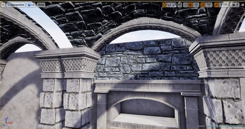
Up until now, I’ve always used a flat ceiling as they are quite easy to use. While I am under a tight deadline, I feel that should never stop someone from experimenting and trying something harder even if it fails. As such, I tried to use a more advanced setup that involved two pillars one on each side, a curved ceiling, and four arches making it a total of 7 pieces.
That, however, was a bit complex and ended up failing when I tried to replicate and move forward with it. I tried it out first at the start of my zone. This resulted in quite some funny fails. Even when I went in and tried to adjust each pillar and other elements manually it was going to be a hot mess if I needed to do this a thousand or more times.
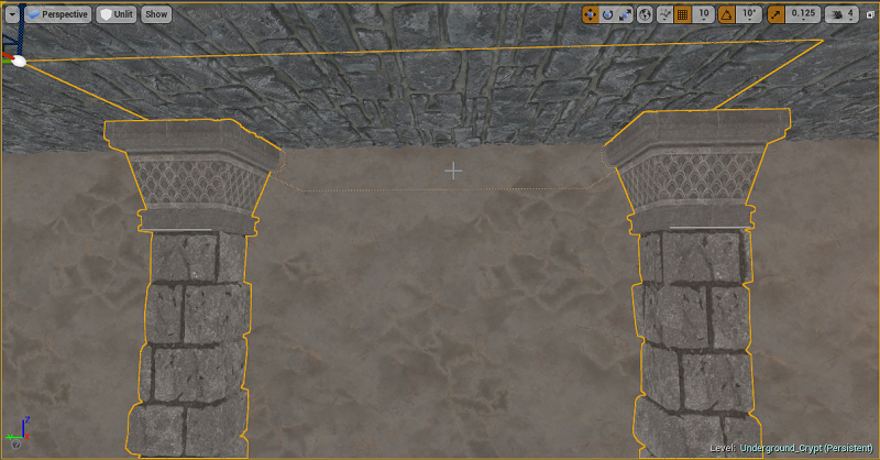
So I took a look at what failed and if there was anything I liked about this attempting. I’ve yet to use pillars to look the ceiling is being held up by them. I rather liked the look it was giving for this particular zone along with the many other design elements I was going to use. So I simplified it again to just being a flat ceiling and used pillars to add more of a dimension to my passageways and rooms.
I think the result turned out rather nice. Even better once the lighting is added in later on. I may revisit using a non-flat ceiling in the future. I might even need to build everything else of a zone around such a roof time to have things line upright in the first place. Which for me is a bit backward since I tend to leave the ceiling for last.
I even tested throughout the zone different amounts of how far the pillars stick out from the wall. While it might seem a bit odd to future players I left them a couple of different wings different amounts from the rest in my continued experimentation of using pillars. I find they can help a passageway feel more claustrophobic with them pulled out far enough.
Pillars also turn out to be excellent for hiding level design sins! If I wanted to make this zone as perfect as possible I could have spent a week(s) on it messing with every little thing until it was perfect. This zone has a lot of turns and thus corners that don’t always want to lineup ended to end creating pixel in length gaps sometimes that results in the player being able to see outside of the dungeon.
While this is still smaller than the first dungeon I created. That one also took me over week’s actual time messing around with it that first zone. This crypt, on the other hand, was done in 48 hours over a Thursday and Friday to get it to this point. Which is a massive decrease in time spent since it was not dragged over two weeks or however long I spent on that first zone.
Starting Area
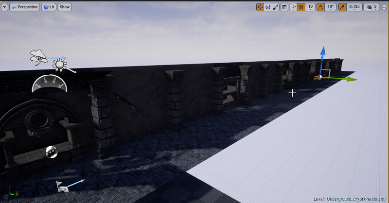
This is the starting section of my zone that leads into the main room. I built out a section of it as I played around with a couple of ideas I had. Such as the curved ceiling that I’ve mentioned above. While I have “lit” mode on to display shadows and lighting prevue to give myself a bit of a feel for this zone. I turn that off after some point till I start to work on lighting at later stages.
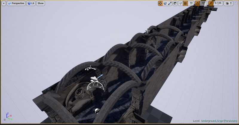
I struggled for quite some time trying to get a curved ceiling to work. We can see in this view looking down all the curved pillars. They also never really rested on the main pillars in any way that I liked. While I could have made them bigger to try and match the size that just further compounded issues I was having. Sometimes to get a look you want the view that players would never get to see are quite ugly showing any short fails.
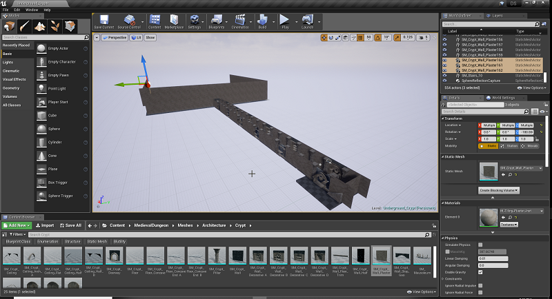
Some further progress I’ve done after a while. The ceiling I use you can see right through the top of it. This makes it perfect for looking at things in a more zoomed-out view.
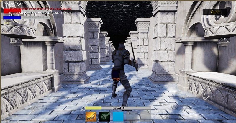
This is one of the almost endless playthrough run tests that I do throughout my level design. I feel it is important to see exactly how the player will see something by running around on the character yourself. We can see how I have the pillars that stick out quite a bit that makes it feel rather claustrophobic. I ended up not liking that look as much later on.
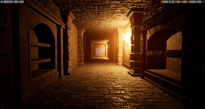
This is the final look for now with everything put together and built out for this zone. I’m not 100% happy with the fog level. That, however, will take quite a few lighting rendering to work out and could take an entire day itself. With it being a crypt I want a decently thick fog. You can see off in the distance it is doing a decent job at lowering visibility in this dungeon.
I also ended up pushing in the pillars more into the wall. Which only exposes around 50% which I think just gives it a better look. While most of the dungeon pillars are like this. I have a couple of areas I left my old 70-80% or so pillar exposed look.
Focus Around A Centralized Room
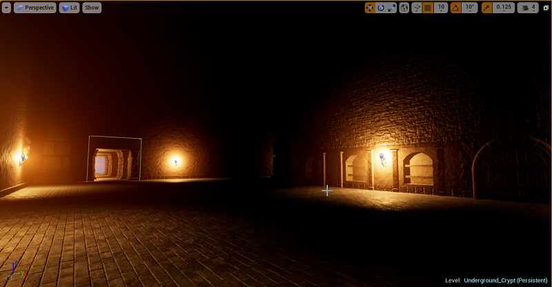
I wanted this room to feel massive. With the way the lighting is set up, you can’t see the ceiling. The player will be going in and out of this room as they enter into all the side passageways looking for a way to unlock the door that leads to the inner section.
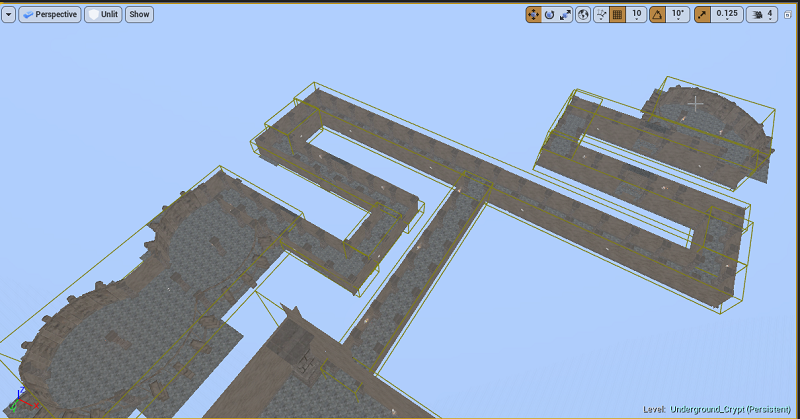
While I don’t usually like to have the player backtrack through an area they have already cleared. With the way this dungeon is set up that just how it goes to leave myself enough room going around the center point to have a bunch of little areas to explore.
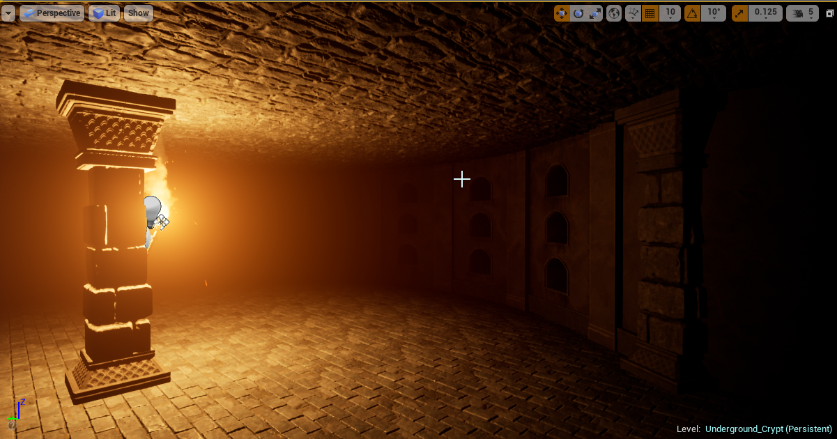
This is just one of many dead endpoints of interest in this zone. While some of them will just provide an area to kill some monsters. Many of them will be critical for the player to come across and interact with for unlocking the door in the center area.
While in a lot of my zones I like to spend the time to add in a lot of finer details with small objects like bones, spiderwebs, tables, chairs, beds, chains and so forth. You might notice this zone is rather void of all of that. I didn’t feel like from a design element I needed to give rooms an actual purpose by going that route. Each room's purpose this time around is, “does it contain what the player needs or not”?
I am also at over 8k+ objects so maintaining a decent frame rate was also a concern. This is quite a massive zone outright as it is. I’m rather happy with how it turned out and the direction I went for this zone in general.
Reflection Capture
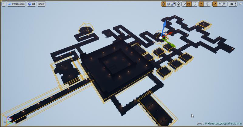
In the past, I’ve been rather generous with having everywhere in the zone reflections spheres for surfaces. This time I limited it to a lot of the smaller rooms or points of interest rooms. Some areas I even purposely for reasons I won’t be disclosing did not add any in. Which can be seen from the yellow boxes in the screenshot above.
It’s not something the player is going to notice a lot when going down random small passageways anyways if it is missing. As they will be a bit distracted with clearing enemies and looking for a path forward.
For the areas that do have it. It also helps give more of a point of interest feeling with rooms having reflection surfaces enabled. In total there 14 of reflection capture areas set up and I even experimented with non-sphere reflection capture areas as well.
Light Mass Importance Volume
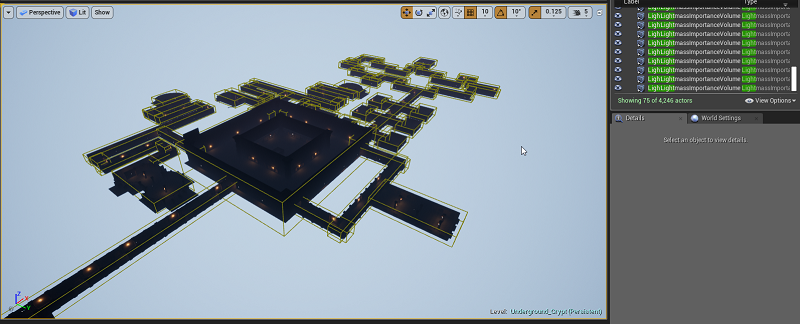
More times than not to make Unreal Engine 4 “happy” with some of the things that would pop up as missing I would just make one massive Light Mass Importance Volume area and call it a day. Some of my other zones I could also get away with it as they were smaller and the volume would not have too much void space between everywhere else.
This time around I spent some time and set up 75 Light Mass importance volume areas (the yellow boxes). The biggest fear is missing a section and having the player experience a massive drop in light quality. This volume tells Unreal Engine 4 were to focus on building out light and areas that are not important and can have lower quality lighting.
I must say this zone took a lot less time than I was expecting to render lighting. The time saving could be enough over the long run that it be worth investing the time upfront to do this again in the manner I did. While I had noticed improved times doing it the other method I had before. It’s become quite clear I can save a lot of time if I put in the effort up front.
Message Log

Once everything is built out it’s time to look at the message logs and it was ugly this time around. With me trying quite a few different things this time around. Along with some other workflow stuff I’ve not talked about. The result was a couple of hours needed to clean things up and make some fixes.
For the large part among the 5,034 issues that came up during the map check. It was just overlapping meshes. For my workflow, I’ve been trying to use a top perceptive view more often. It’s great when I want to highlight a larger area to either move or copy it. The downside is any overlapping issues get compounded. As a result, I removed over 1k objects manually as I went around checking all these issues areas.
For whatever strange reasons I must have been tired on one of the nights, I was working on this. I had five layers of flooring stacked upon each other. After finding that section of a passageway which I’ll never understand how that even happened in the first place. It did clear out a few hundred issues from that alone.
There were also some areas that I needed to rebuild how I went about that spot. I had one area that was connecting to another after being a great distance apart. I thought I did a clean job of aligning everything up. I had overlooked the fact I had a couple of very small holes that I just dropped in an unclean way some mesh to cover up. Without thinking about it was I was in a build and move forward train of though.
Cleaning all this up and removing several meshes colliding with each other and glitching out when you run past them. It also improved my overall frame rate by about five in some of the more intense areas. While overall maybe giving a 1 to 2 frame rate boost it’s hard to say.
I am rather pleased that I did not have any issues regarding lighting this time around. At least according to the message log. There is still some stuff I know that will need to be adjusted before I go in for a final high-quality light build rendering a year or so down the road.
This part took longer than I was expecting. It is also a rather boring process most of the time clicking on objects and deleting or rethinking an area to make it cleaner. It is, however, part of the process and something that most times is not a challenge unless a new kind of error I’ve never dealt with appears.
Final Thoughts
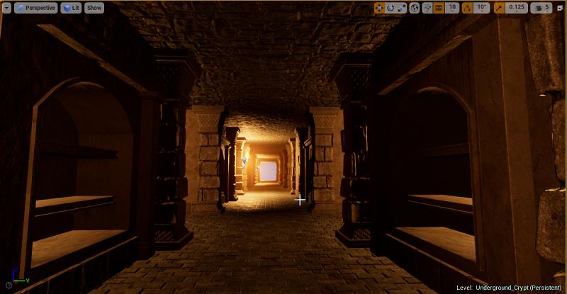
I attempted a couple of new things while creating this zone. Some of them didn’t work out or lead me in a new direction as I took what worked and moved forward. While others worked out great and will be things I keep in mind when creating all the other zones.
For now, these are still fun to create. If I’ll be able to keep up to my roadmap of around two zones a week instead of my normal pace it will be quite challenging and time-consuming. I do expect at some point to start getting behind. From a technical standpoint, there are some up and coming zones where the things I want to do will require me to create an entirely new process of approaching them and that takes time.
Other Posts:
Information
Screenshots were taken and content was originally posted by our main developer on his blog found [here]. Screenshots are from Unreal Engine 4.
Get Nightly Dungeon
Nightly Dungeon
A dungeon awaits. A RPG dungeon-crawler.
| Status | In development |
| Author | enjargames |
| Genre | Role Playing |
| Tags | Dungeon Crawler |
| Languages | English |
More posts
- The Making Of The Fallen MapJan 21, 2022
- The Making Of Insanity Realm MapJan 10, 2022
- The Making Of Underground Ruins MapNov 23, 2021
- The Making Of The Passage MapOct 31, 2021
- Nightly Dungeon | NPC Combat And Loot DemoOct 02, 2021
- The Making Of The Underground Temple MapSep 20, 2021
- The Making Of The Abyss ZoneSep 12, 2021
- The Making Of the Anguish DungeonSep 06, 2021
- The Making Of The Lower Prison ZoneJul 25, 2021
Leave a comment
Log in with itch.io to leave a comment.